Colours
Generate a full Tessolo colour palette from one brand colour or set all nine colours by hand, for light and dark, with readable contrast.
Generate from your brand colour
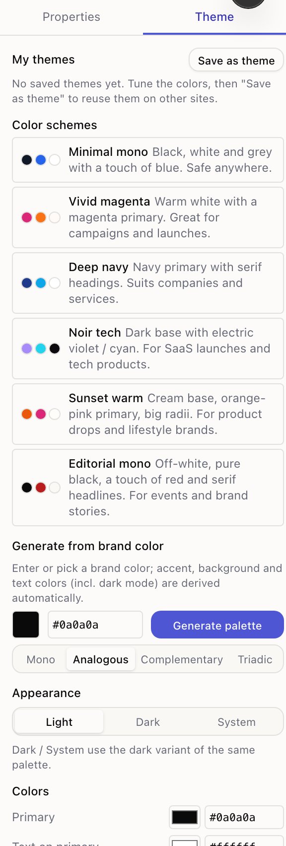
The fastest route. Open Theme → Generate from brand color, enter or pick your colour, and press Generate palette.
Accent, backgrounds and text colours are all derived from it — including the dark-mode versions — with enough contrast to stay readable.
A harmony setting decides how the accent relates to your brand colour:
| Harmony | Result |
|---|---|
| Mono | Shades of your colour. Calm, safe, slightly plain |
| Analogous | Neighbouring colours. Harmonious with a bit of variety |
| Complementary | The opposite colour. High contrast, good for buttons |
| Triadic | Two evenly spaced colours. Lively, easiest to overdo |
Try them all — it's one click each and the canvas updates live.
The nine colours
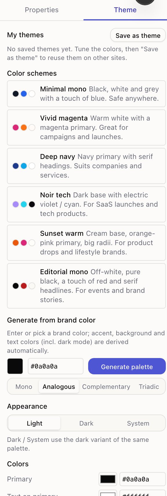
| Slot | Used for |
|---|---|
| Primary | Main buttons and links |
| Text on primary | Text sitting on the primary colour |
| Accent | Highlights, badges, secondary emphasis |
| Text on accent | Text sitting on the accent |
| Page background | The page itself |
| Body text | Ordinary text |
| Muted background | Alternating bands, cards |
| Secondary text | Captions, metadata, less important lines |
| Border | Card edges, dividers, input outlines |
The pairs matter. If you change Primary, check Text on primary still reads against it — that's the pair that goes wrong most often and it's the colour your main button uses.
Light and dark
Appearance decides what visitors get: Light, Dark, or System (follow their device).
Dark and System use the dark variant of the same palette. When you're editing with a dark appearance the panel tells you plainly — You are editing the dark-mode colors — so you always know which set you're changing.
Generating from a brand colour fills in both variants, which is why it's worth doing even if you plan to hand-tune afterwards.
Getting contrast right
Two checks that catch nearly everything:
- Body text on page background. Read a paragraph at arm's length. Grey-on-grey looks refined on a designer's monitor and is unreadable on a phone in daylight.
- Text on primary. Look at a real button, not the swatch.
If either is uncomfortable, move the text colour rather than the background — backgrounds carry the brand, text carries the meaning.
Starting over
Reset to defaults puts the palette back. It only affects colours you've changed, and it's a draft change like any other, so ⌘Z still works.