A different image per device
Show a different image on phones in Tessolo — say a tall crop of a wide hero — without adding a field, including for section backgrounds.
A wide landscape hero looks right on a laptop and turns into a thin strip on a phone. You can give phones their own picture.
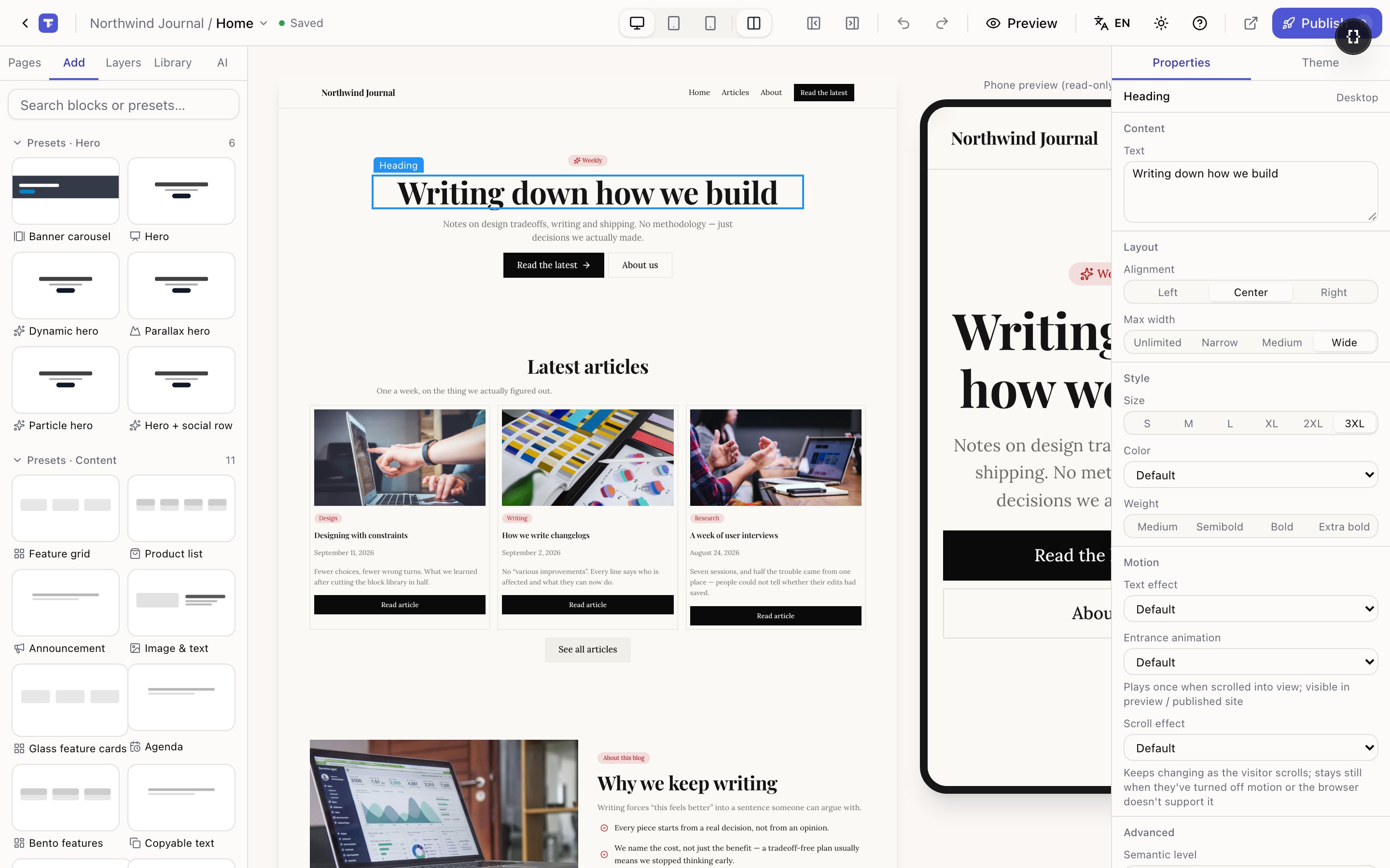
There's no extra field for it. You use the same setting you already know: switch device first, then change the image.
Switch to the phone view
Press 3 or use the device switcher in the top bar.
Select the image and replace it
Click the image, then Replace in the right panel. Pick your portrait crop.
Check desktop is untouched
Press 1. The desktop image should be the original. If it changed, you were on the desktop view when you swapped — undo and try again.
The block help text says the same thing: switch to the tablet / phone breakpoint and change the image to give small screens their own picture.
What visitors get
Each visitor's browser downloads only the image that matches their screen. A phone never fetches your 3000-pixel desktop hero just to hide it.
That's the real reason to do this — it's a page-speed win as much as a design one, and page speed on phones is where most sites lose people.
Sizes are handled anyway
Even with one image, every visitor gets a version sized for their screen, in a modern format their browser understands. Upload the original and forget about it.
Per-device images are for a different crop or a different subject, not for making things smaller.
When it's worth it
Worth it: a wide hero that loses its subject when cropped; text baked into a graphic that becomes unreadable; a product shot that needs to be closer on a small screen.
Not worth it: ordinary photos in content. They scale fine, and a second image is another thing to keep in step when the picture changes.
Section backgrounds
A Section's background image works the same way — switch device, change the image.
Backgrounds are where this pays off most. A wide scene behind a heading almost always needs a tighter crop on a phone, or the subject ends up outside the visible area entirely.
Alt text
Write alt text for images in Tessolo: what it does for accessibility and SEO, how to write it, decorative images, and the pre-publish check.
Video, files, fonts, 3D models and Lottie
Everything that isn't an image in Tessolo: embedding or uploading video, documents for download, fonts, 3D models and Lottie animations.