Desktop, tablet and phone
Make a Tessolo page work on desktop, tablet and phone: per-device overrides, settings that flow downhill, hiding blocks and checking your work.
Most of the time you don't have to do anything: blocks reflow on their own and the result is fine. This page is about the times it isn't.
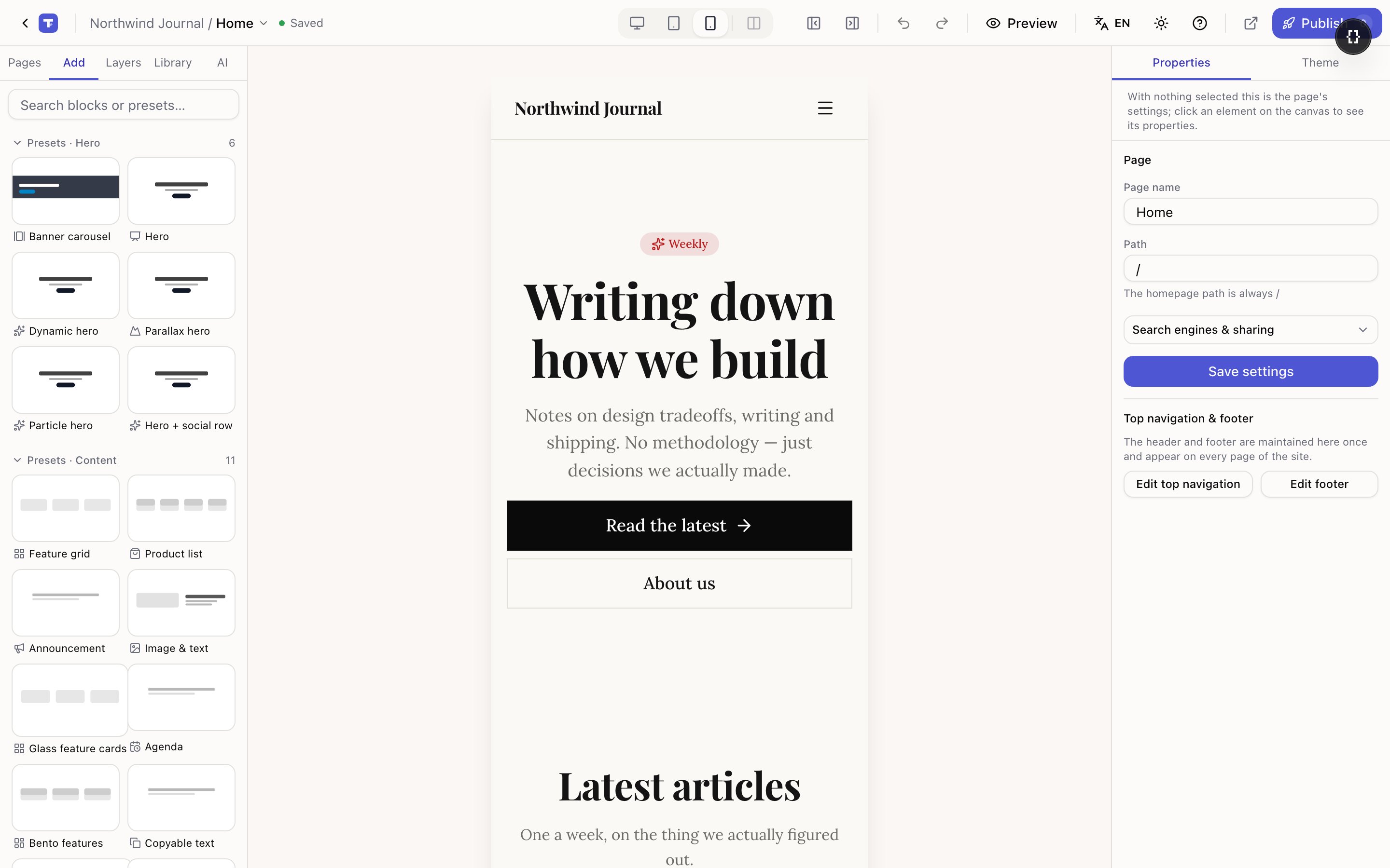
Three views of one page
There is only ever one page. The device switcher changes how it is drawn, not what it contains. You never build a separate mobile version, and you can't have a block on desktop but not in the underlying page.

| View | Roughly matches |
|---|---|
| Desktop | Laptops and larger |
| Tablet | Tablets and small laptop windows |
| Phone | Phones |
Settings flow downhill
Desktop is the baseline. Tablet inherits from desktop, and phone inherits from tablet.
Change something in the desktop view and it changes everywhere. Change it in the phone view and only phones are affected — desktop and tablet keep the old value.
That one rule explains almost everything else:
- To fix only phones, switch to phone first, then edit.
- To change something everywhere, switch back to desktop first.
- A change made on tablet also reaches phone, unless phone already has its own value.
The most common mistake is editing in the phone view and wondering why desktop didn't change. Look at the device switcher before you edit anything.
Not every setting can differ per device
Only settings where it makes sense are per-device — sizes, spacing, alignment, column counts, and the image on an Image block. Things like the text of a heading or where a button links are shared, because having a different link on phones is nearly always a bug rather than an intention.
When a setting can vary, the right panel shows a small marker beside it once you've overridden it for the current device, along with Reset to inherited value to remove the override and go back to inheriting.
The panel header also tells you which device you're editing, so you can always check.
Some things adapt on their own
A few blocks already know what to do on smaller screens, so you don't have to override anything:
- Grids and collection lists reduce their column count. Four to six columns halve on tablet and drop to two on phones; three columns become one on phones.
- Big headings step down a size or two.
- Section padding tightens up.
If you override the column count yourself, your value wins and the automatic behaviour stops for that block.
Pixel widths fall back on narrow screens
When you drag a block's resize handle, Tessolo snaps to sensible presets — half width, two thirds, full width. Those are proportional, so they work on any screen.
If you drop the handle between presets, the width is stored as an exact number of pixels instead. That's fine on desktop, but a 720px-wide box on a 390px phone would be a disaster, so an exact pixel width automatically becomes full width on narrow screens.
You don't have to do anything for this to happen. It's worth knowing because it explains why a block you carefully sized on desktop looks full-width on a phone — that's the safety net, not a bug. If you want a specific narrower width on phones, switch to the phone view and set it there.
Hiding a block on one device
In Properties → Advanced there's Hide on this breakpoint. It hides the block on the current device only.
Use it sparingly. Two common cases where it's right: a decorative image that leaves no room for the text on phones, and a wide table that's genuinely unreadable on a small screen.
Two cases where it's wrong: hiding your main call to action on phones (most of your traffic), and hiding a block instead of fixing its layout — hidden content is still downloaded, so you pay for it without anyone seeing it.
Checking your work
The fourth button in the device switcher shows a phone beside the desktop view. It's a read-only preview, but it means you can edit on desktop and watch the phone result at the same time. That's usually faster than switching back and forth.
Before publishing, walk the phone view down the whole page once. The things worth looking for are text that touches the screen edge, headings that break awkwardly, buttons too small to hit comfortably, and images that have gone taller than the screen.