Resizing on the canvas
Resize blocks on the Tessolo canvas with drag handles and snapping, split grids, and switch to exact numbers when a precise size matters.
Select a block and small handles appear on its outline. Drag one to resize.
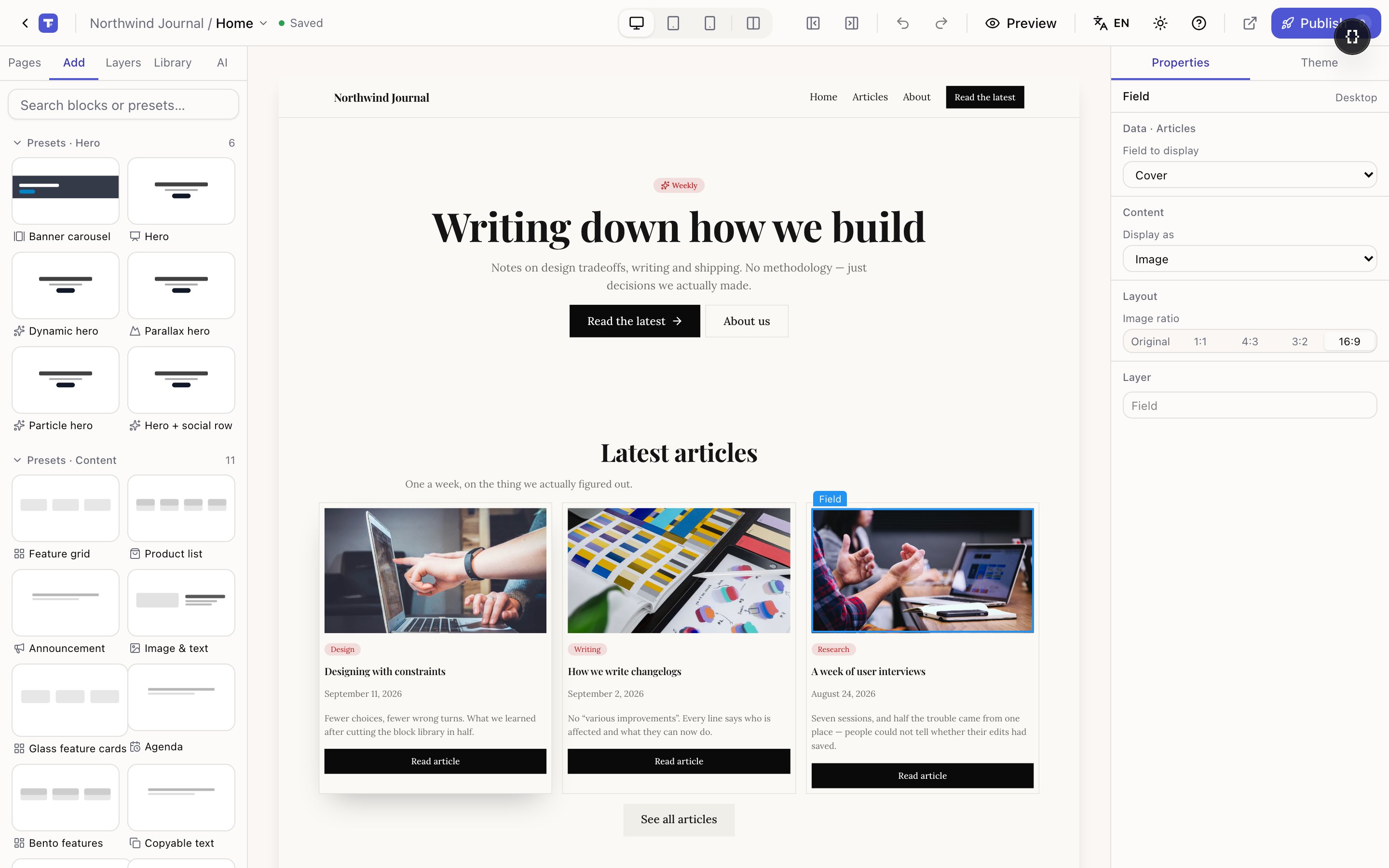
This changes the block's size setting and nothing else. Blocks stay in the normal flow of the page — resizing never turns your layout into free-floating boxes that overlap on someone else's screen.
Which blocks have which handles
| Block | Handles |
|---|---|
| Image, Video, Box | Left and right, to change width |
| Image | Also a corner handle, which keeps the shape and changes both |
| Section, Carousel | Bottom, to change height |
| Grid with two columns | A handle on the divider, to change the split |
Blocks not listed have no handles because a free width wouldn't mean anything for them — their size comes from their contents or their container.
Snapping
As you drag, the block snaps to sensible stops: half width, two thirds, full width, and for sections a half or full screen height. A two-column grid snaps to ratios like 1:1, 1:2, 2:1.
Snapping is not a nicety, it's the safe path. A snapped size is stored as a proportion, so it stays sensible on every screen. If you drop the handle between stops, the size is stored as an exact number of pixels instead — fine on desktop, but a fixed width can't adapt.
Tessolo protects you: an exact pixel width automatically becomes full width on narrow screens, so a 720px box never sticks out of a 390px phone. You don't have to do anything. It's worth knowing because it explains why a block you carefully sized on desktop looks full-width on a phone — that's the safety net, not a bug.
If you want a specific narrower width on phones, switch to the phone view and set it there.
One drag is one undo
However far you drag and however many intermediate sizes it passes through, letting go creates one history step. ⌘Z puts it back where it was.
Grid splits
With a two-column grid, the divider handle sets the ratio — 1:1, 1:2, 2:1 and so on. It's the quickest way to build "wide text, narrow sidebar" without touching numbers.
The handle only appears when the grid really has two columns and isn't using an automatic minimum item width.
When you'd rather type a number
Every size you can drag is also a field in the right panel, under Layout. Dragging is faster for finding a look; the panel is better when you want two blocks to match exactly.