Surveys and question types
Single choice, multi choice and rating questions, and the thank-you screen.
A survey is a form. Everything on the form pages applies — submissions land in the console, notifications and webhooks still fire. What's different is the question blocks and the results view.
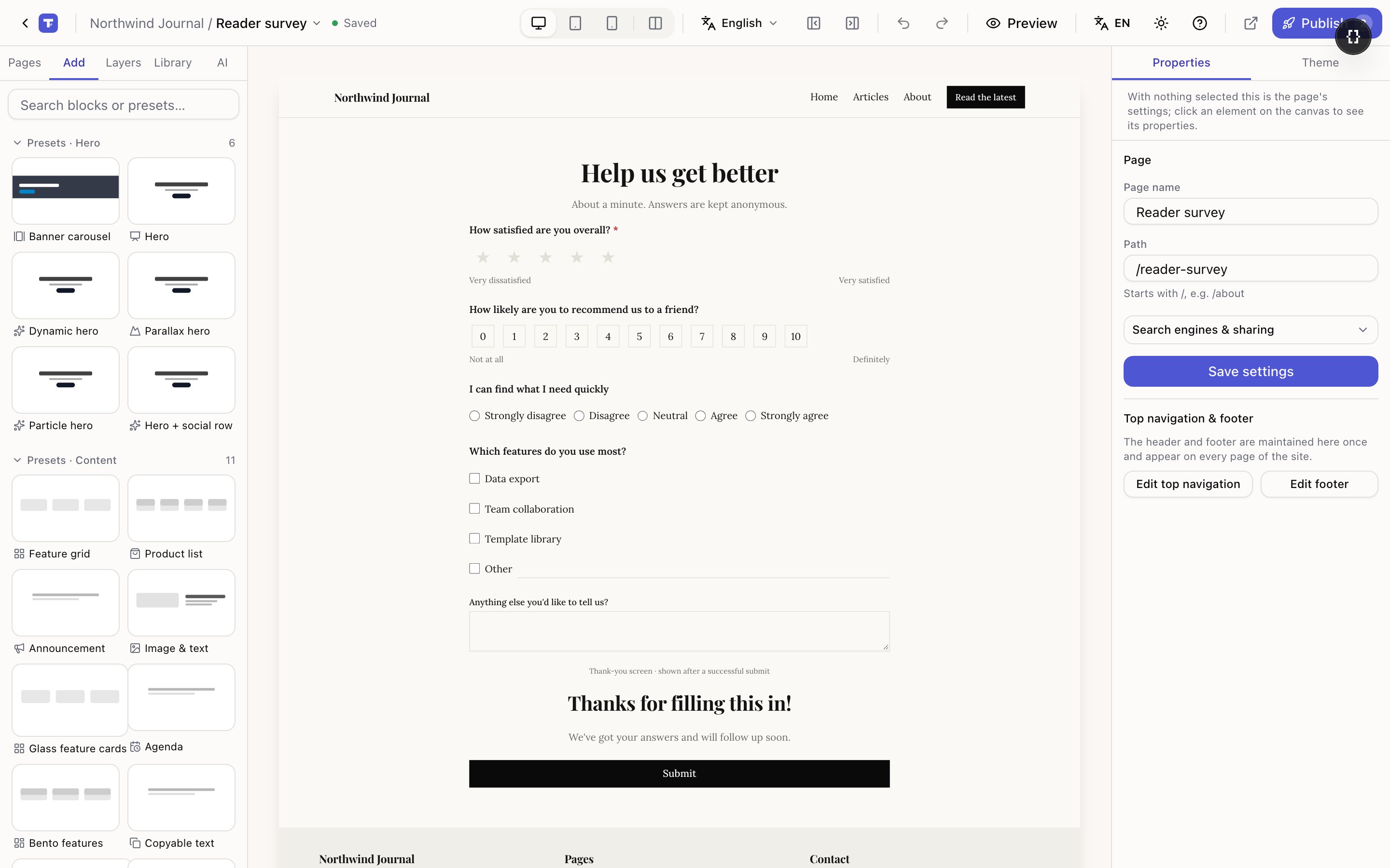
- 1Rating — stars, with a hint at each end
- 2Rating — the 0–10 recommendation scale
- 3Thank-you screen — replaces the form after submitting
Starting one
The quickest route is New page → Survey. Two starting points:
- Survey — a satisfaction survey: rating, choice questions and a thank-you screen.
- One per screen — the same questions split into steps, one question at a time. Better completion on phones.
You can also drop a blank survey in from the editor's add panel, under Forms.
The three question blocks
Ordinary inputs — a name, an email, a comment — are the blocks described in building a form. The three below exist because a survey question is one thing: the prompt, the hint and all the options live in a single block, so you never have to assemble a question out of a heading plus five separate checkboxes.
Single choice
Visitors pick one. Set the options one per line.
Two options worth knowing:
- Allow an "Other" answer adds a row at the end that the visitor fills in themselves.
- Options have a low-to-high order — turn this on for scales like Strongly disagree → Strongly agree. It's what lets the results view show an average instead of just percentages.
Option layout switches between stacked, inline and cards. Cards are worth it when there are three or four options and you want them to feel like a choice rather than a list.
Multi choice
Same idea, several answers. Pick at least and Pick at most bound it — use at most when the question is "choose your top three", otherwise people tick everything.
Rating
Three styles:
| Style | Looks like | Use it for |
|---|---|---|
| Stars | ★★★★★ | Satisfaction, quality |
| Numbers | 1 2 3 4 5 | Anything where the number itself is the point |
| NPS 0–10 | 0 … 10 | "How likely are you to recommend us" |
Top score sets where stars and numbers stop; NPS is always 0–10 and ignores it. Left-end hint and Right-end hint label the two ends — Very dissatisfied / Very satisfied. Without them a bare 1–5 means different things to different people.
Pick NPS only if you actually want the NPS calculation (promoters minus detractors). It's a long row of numbers on a phone; a 1–5 rating is easier to answer and easier to read.
Every question has a column name
Each question block has Advanced → Column name in submissions. That's the header in the CSV export and the key results are grouped under.
Leave it empty and it follows the question text. That's fine until you reword the question — then old and new answers stop lining up. If a survey is already collecting answers, set an explicit column name before you touch the wording.
The pre-publish check flags two questions that share a name, because the export splits them
into name and name 2, which is easy to misread.
The thank-you screen
Drop a Thank-you screen block inside the form and it replaces the whole form after a successful submit. Put anything in it — a sentence, a coupon code, a button back to the shop.
Without one you get Tessolo's built-in success message, which is fine for a contact form and thin for a survey where you promised a discount code.
On the canvas the thank-you screen is always visible so you can edit it; visitors only see it after they submit.
The other option is After submit → Go to a page, which sends people to a page of your own. Use the thank-you screen when the message is short, a redirect when the destination is a real page you want indexed.
Questions have to be inside the form
A question block dragged onto the page next to the form — rather than inside it — collects nothing. Tessolo tries to put it in the right place for you when you drag one in, and the pre-publish check flags any that ended up outside.