Showing entries on a page
Show collection entries on a Tessolo page with the Collection list block: point it at a collection, choose a layout and set what each card shows.
A collection on its own is invisible to visitors. To show it, you put a Collection list block on a page and point it at the collection.
If your template created the collection for you, the homepage already has a list pointed at it. Click that list and skip to choosing the layout.
Add the block
In the editor, open Add in the left panel and find Collection list under the Collections category. Drag it onto the page.
It lands empty until you tell it which collection to use.
Point it at your collection
With the block selected, the right panel opens on a Data section. Pick your collection from the Collection dropdown.
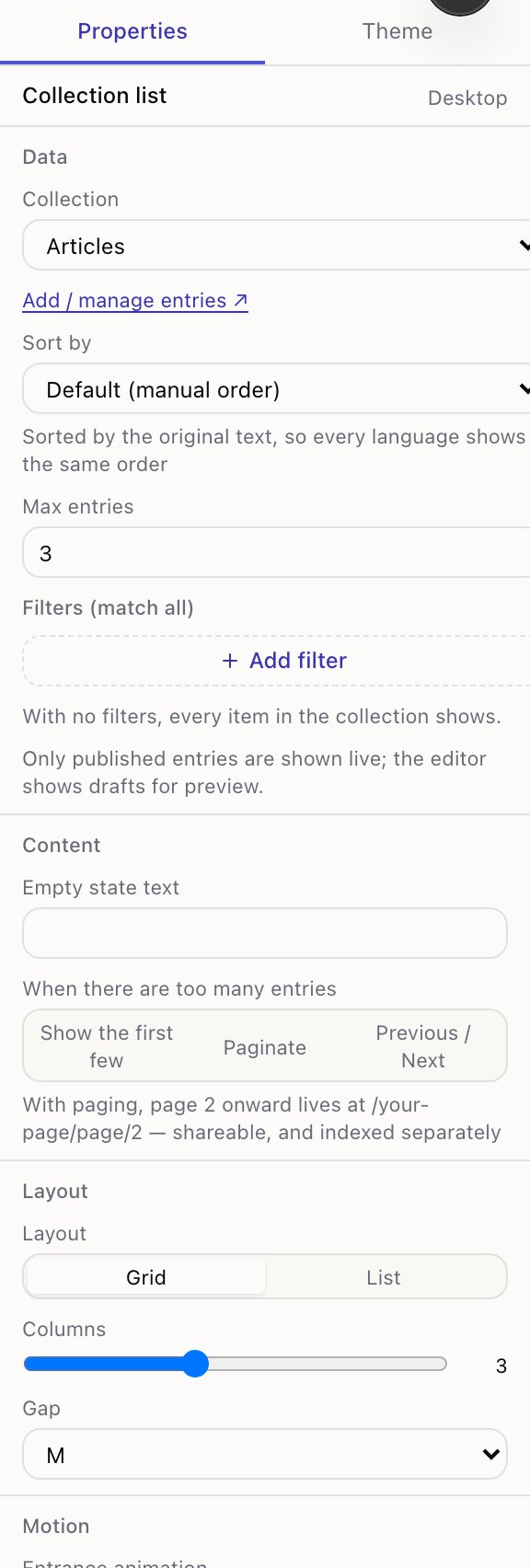
- 1Which collection to show
- 2Sort by — or keep the order you dragged rows into
- 3Max entries — leave blank to show them all
- 4Filters — show only some entries
The block fills with real entries straight away. Add / manage entries ↗ opens the collection in a new tab if you need to add more.
Choose the layout
Further down the right panel:
| Setting | What it does |
|---|---|
| Layout | Grid for cards side by side, List for full-width rows |
| Columns | How many cards per row on desktop. Fewer on small screens automatically |
| Gap | Space between cards |
| Empty state text | What visitors see when nothing matches |
A tip that saves an ugly page: make the number of entries a multiple of the column count. Three columns showing four entries leaves one lonely card on the second row.
What appears on each card
This is the part that surprises people. You don't pick the title and image on the block. Each card is built from the collection's Display mapping — one setting for the whole collection, so every list of it looks consistent.
Open the collection and press Display mapping. Each role gets a dropdown listing your fields:
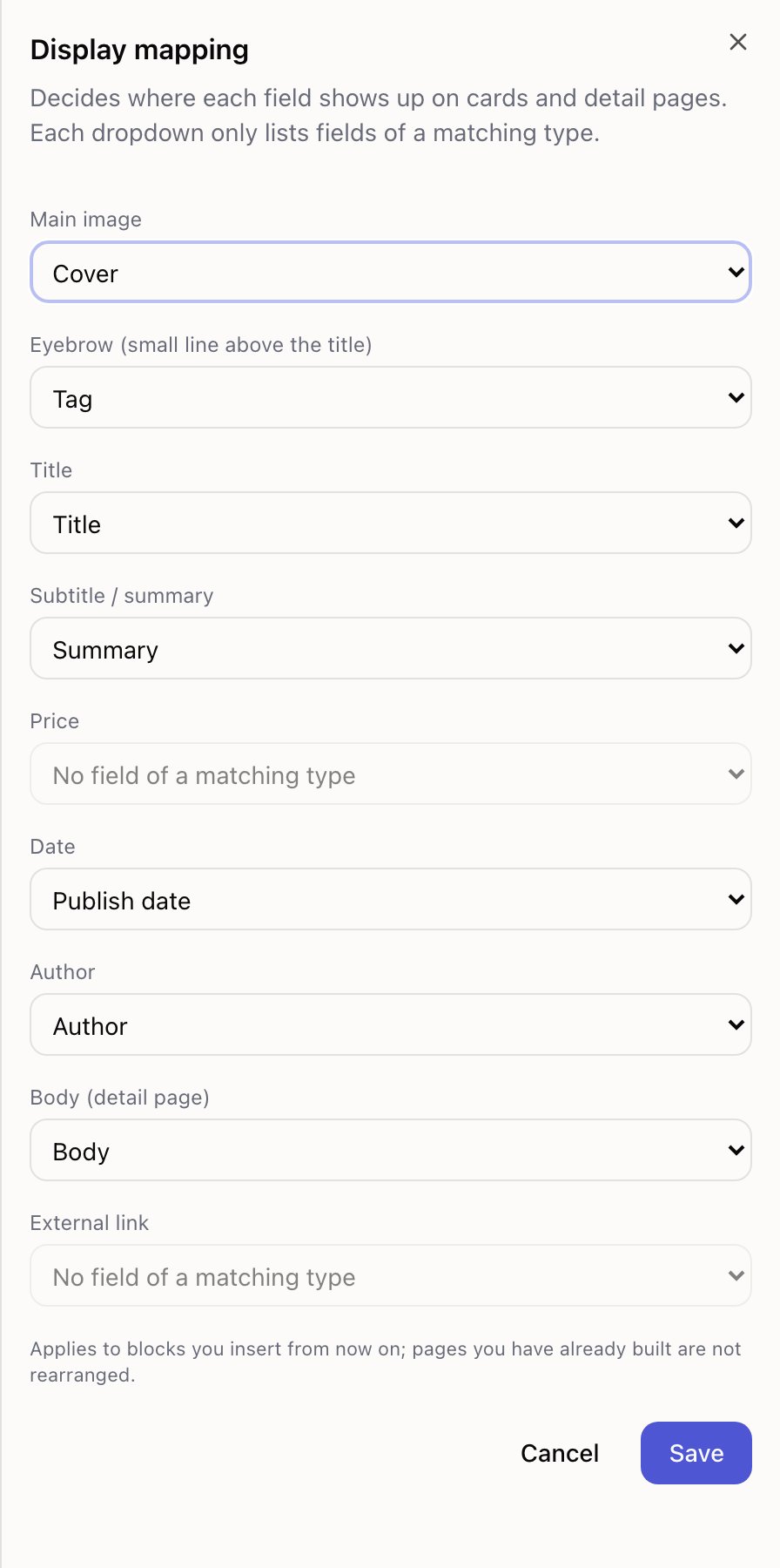
Title · Subtitle / summary · Main image · Price · Date · Author · Eyebrow (the small line above the title) · Body (used on the detail page) · External link.
Each dropdown only offers fields of a matching type — a date field is never offered as the main image. Any field left as Not shown simply won't appear anywhere, and the panel warns you which ones those are.
Display mapping applies to blocks you add from then on. Lists already on your pages are not rearranged. If you change the mapping and an existing list looks the same, that's why — adjust that list's fields by hand, or delete it and add a fresh one.
Changing one thing on the card
To change just one element — say the card shows the summary and you want the author — click that piece of text on the canvas. You'll select a Field block, and the right panel gives you:
- Field — which field it reads
- Display as — Text, Heading, Badge, Price, Date, Image, Link, Button or Rich text
- plus the usual size, colour and alignment
You can also add a Field block that wasn't there before: select a card, add a Field block inside it, and choose what it shows.
Only published entries appear
On the canvas you see drafts too, so you can lay the page out before the content is finished. On the live site only published entries appear. The panel says so right under the filters.
If a list looks right in the editor but is empty or short on the live site, this is nearly always why. Open the collection and check the status column.
Filters and sorting
Filters (match all) takes up to three conditions — a field, an operator, and a value. The operators are is, is not, contains, greater than, less than, before and after. An entry has to match every one of them.
For a field that points at another collection, the value is a picker showing entry names, so you never type an identifier.
Sort by offers each field, plus Default (manual order) — the order you set by dragging rows in the entries table.
Sorting and filtering always use your default language, even on translated pages. Both language versions of a list have to contain the same entries in the same order, or the translated pages stop lining up with each other. It also means a filter value you typed in English keeps working on the translated version instead of silently matching nothing.
Long lists
When there are too many entries offers three behaviours:
- Show the first few — show what fits and stop. Combine with Max entries.
- Paginate — split across numbered pages, with Per page setting the size.
- Previous / Next — same split, but with prev/next links instead of page numbers.
With paging, page two of a list at /articles lives at /articles/page/2. That's
deliberate: an address like that is treated as a real page by search engines, so page two
can be found on its own, and it loads faster for visitors than the alternative. Page one is
always the plain address with no suffix, so the same content never ends up at two addresses.
Carousels are different
A Carousel can also be bound to a collection, and there the field mapping is on the block: Background image field, Title field, Description field, plus Image overlay and Text position. Once bound, any slides you placed by hand are hidden and the entries take over.
Use a carousel when the pictures are the point and there are only a handful of entries. Use a list when people need to scan and compare — a carousel hides everything except the current slide, from visitors and search engines alike.
Two lists from one collection
You can point as many blocks as you like at the same collection, on one page or across pages, each with its own filters, sorting and layout. A homepage showing three featured products and an "All products" page showing everything is two lists over one collection.
Display mapping
Display mapping tells Tessolo which collection field is the title, main image, price or date, so cards and detail pages show the right content.
Filters and sorting
Filter and sort the entries a Tessolo Collection list shows, set per block, including the language rule and what to do when a list is empty.